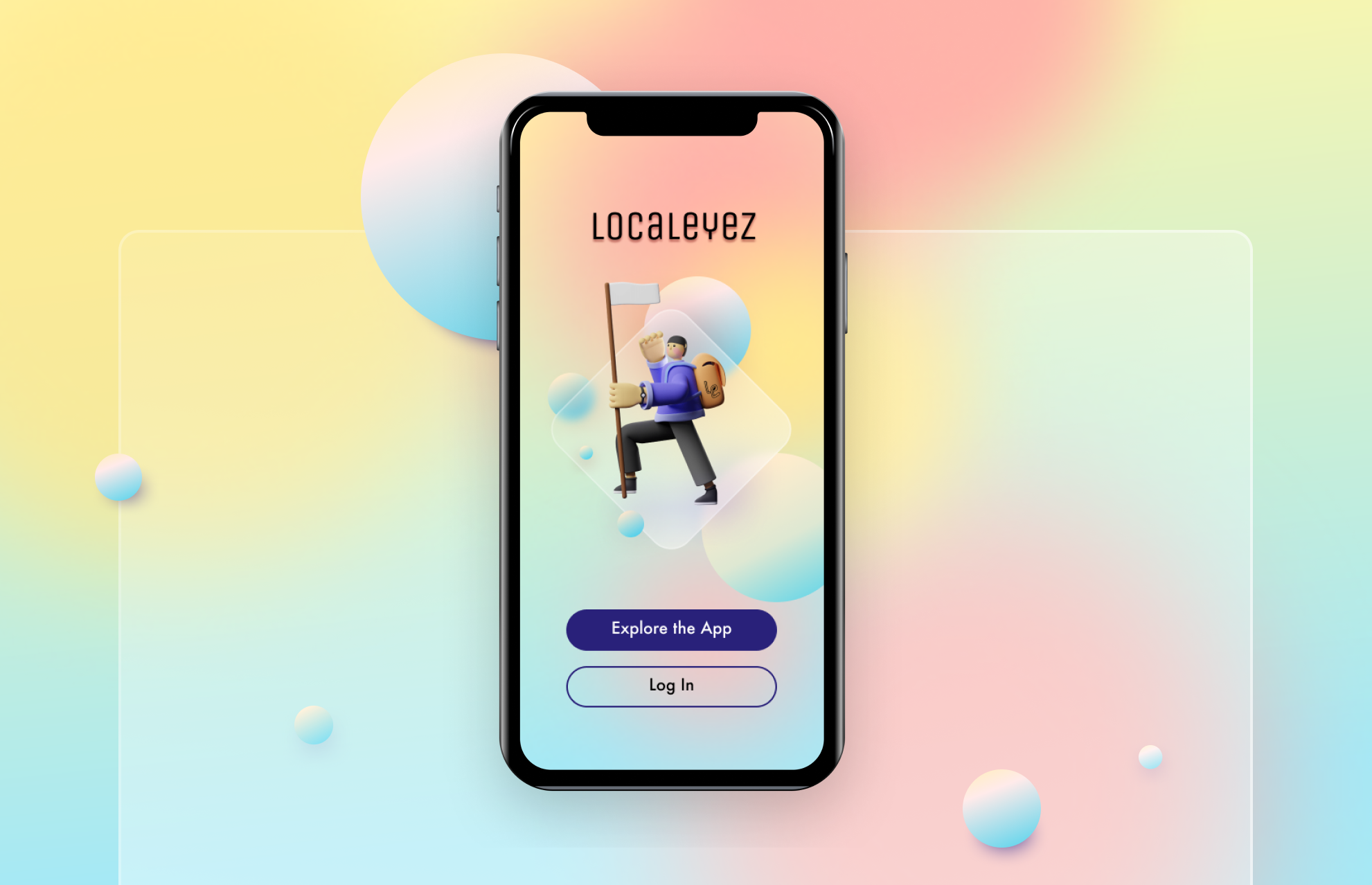
Localeyez Mobile App
Localeyez is a mobile app that uses machine learning to find and suggest events that its users might enjoy. The app is for anyone who’s interested in finding things to do like sports, live music, family activities, etc. Localeyez provides users with personalized activities based on their preferences. People can search for events, share with friends, and purchase tickets, all in one place.
My Role: UX Design | UI Design
Overview
The Challenge
The client needed a mobile app designed from the existing web interface app. With the mobile app design, Localeyez also wanted to provide an even more tailored experience for their users primarily using preference learning technology, while also making the entire experience more fun and delightful.
The Solution
The new mobile app leverages machine learning technologies to make recommendations based on a user’s purchased and saved events. It proactively makes recommendations for you while also allowing you to explore new activities.
I wanted to design a user interface that would be fun, exciting, and trendy, while successfully appealing to a very diverse audience.
The Target Audience
Age: 21 to 50 years old
Annual income: $30,000 to $120,0000
Location: Large Urban Areas, United States
Interests: Food Tours, Bar Crawls, Trivia Nights, Hiking, Festivals, Block Parties, Art Walks, Sports, Nightlife, Concerts, Board Games, Family Friendly, Bowling
Attitudes: Optimistic, Social, Seeks Spontaneity
Challenges: Social Isolation due to Urban Culture, Lack of Time and Organization for Family Outings, Friends are Picky
Process
Review User Research
Branding & Identity
Low Fidelity Wireframes
Visual Design
User Testing
Conclusion
Review User Research
Client Goals & Desired Outcome
The client wanted to shift business strategies with a newly designed mobile app leading the charge. Specifically, I was looking to answer these questions through a new design:
How can users find activities they want to go to?
How can users be more engaged with the app?
How can users feel that they have control over what they see on the app?
For this project, my primary role on the team was a UI designer and secondly a UX designer. I was provided with the necessary user research to begin the visual design.
Personas
Demographics
26 years old, Software Engineer
Single, no kids
Personality
Passionate, adaptive, resourceful, energetic, personable, creative
Expectations & Goals
Search nearby sports venues, connect with similar sports-enthusiast people, play local tournaments, participate in local trekking events
Demographics
36 years old, Pre-K Teacher
Married, 2+ kids
Personality
Extroverted, analytical, liberal, active, family-oriented, multitasker
Expectations & Goals
Easy navigation, fast responses, easy readability, quick loading, current events, local events, high-quality images
“Being recent college grads, my friends and I still like to go out and have a good time every once in a while.”
Types of Events:
Wine tastings
Art exhibits
Club events
“I like to go out and network with other professionals like myself.”
Types of Events:
Meetups
Happy hours
Conferences
“I like to have lots of fun with my friends on the weekends after I get all of my homework out of the way.”
Types of Events:
Movie premieres
Popup shop events
Park events
Desktop Wireframes & Site Map
Provided Brand Assets
Comparative Research
Classpass does a fantastic job of allowing users to filter by preference, choice, and location. A user may find exactly what they’re looking for through a robust UX design around the search and discovery experience.
Airbnb Experiences organizes its home feed by location, categories, and hosts. Sprinkled throughout are suggestions for other locations or popular events in your current city. Their UX includes easy vertical and horizontal scrolling, allowing the user to interact in several engaging manners.
MeetUp has an intuitive and seamless onboarding flow where you can input your interests and then sufficiently explore the app as a guest before having to create an account.
Yelp provides an easy and seamless discovery experience by enabling users to search with keywords and also search by location to populate new results. It provides suggestions as the user types, as well as shows your recent search history.
Once I reviewed the material, I conducted a web interface inventory to ensure that I accounted for all the functions and capabilities of the app before I went into the visual design phase.
Branding & Identity
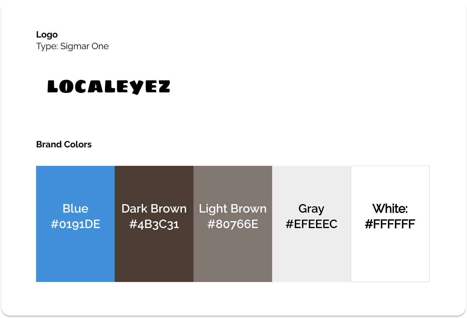
After studying the personas and looking at competitors, I wanted to update the color palette, create a new logo, and select new typography to align more closely with the provided mood board and Localeyez’s new business direction.
The Process
To create the logo and to select color choices, I identified common traits shared by the five different personas and came up with a list of six keywords: energy, fun, easy, adventure, possibilities, and fulfilling.
I then evaluated which designs were most successful and most interesting before moving on to creating digital sketches and further refining these ideas.
Low Fidelity Wireframes
Before sketching wireframes, I first researched UI patterns for machine-learning, search and filtering, setting preferences, and reviewing event details to provide users with the best experience possible. From here, I identified the correct usage of the pattern so I could take the appropriate elements and use them towards my design solutions.
Revised Information Architecture
With a deeper understanding of user expectations for personalized recommendations and for event mobile apps, I updated the site map to better meet user needs. The largest changes were bringing “Popular Locally” and adding an “Explore” component to the Personalized Feed. In my research, I found that users like to see these things on the first page and don’t mind scrolling. Most event apps also had a place on the navigation bar to get users directly to their purchased and saved events.
Sketches
I sketched out some initial flows for Onboarding, the Feed, and the User Profile to reflect the newly designed features for the mobile app experience.
Specifically, Localeyez’s goals were:
Onboarding: A more intuitive onboarding process
The Feed: A redesigned Feed optimized for a mobile platform
User Profile: A complete redesign of the user profile screen that enables the user to easily update their bio, choose new interests, see an archive of their past events, fill out their payment information, and add a location
Digital Wireframes
After sketching initial wireframes, I created digital wireframes to flesh out the onboarding flow, the new home feed, and the redesigned user profile. Below is a side by side comparison of Version 1 and Version 2 after some initial user feedback.
Onboarding
Onboarding Flow Version 1
In this version, I prompt the user to sign up right away. However, this is a very poor experience and would lead people to abandon the app when they’re forced into this situation. I revisited Apple’s Human Interface Guidelines on authentication to redesign how I might give people an opportunity to fall in love with my app before being forced to make a commitment.
Onboarding Flow Version 2
I pushed the sign up CTA much further down the process, now giving people a chance to explore first. I removed the prompt to find a first event in order to reduce the number of total steps and work involved before allowing a user to jump in and delightfully explore. Finally, I introduced a confirmation screen to provide feedback, with plans to add an animation element here.
The Feed
The Feed Flow Version 2
I designed out the flow to include the Event Detail Page and My Events Page, which also housed purchased events (“My Events”) and saved events (“Bookmarked”). The new pages show a different navbar as well as back arrows to show how a user might behave and navigate on each page.
User Profile
Visual Design
High Fidelity Prototype
Once I finalized my digital wireframes, I applied the updated branding to the wireframes to create a clickable, high fidelity prototype.
Usability Testing
I tested six users who ranged from their early 20s years to their early 40s, both male and female, on two flows that each had a set of tasks.
Primarily, I wanted to test for:
Is the overall visual design appealing?
Are there any barriers to signing up?
How intuitive is it to find and save events?
Do the Achievement badges provide value for users?
Likes
All testers strongly liked the visual design
Consistent keywords: bright, fun, exciting
Icons were easy to understand and all testers felt that it was very clear what they were supposed to do
Really enjoyed the color-changing animation, though they stated that it would be nice to see a loading bar as well
Event Detail Page’s clarity and design were appealing, as well as the ability to purchase tickets in-app
However users wanted to be able to see this before being prompted to sign up
Dislikes
Readability was compromised with too much translucency on the upcoming event tiles and lack of contrast on category buttons
The heart icon paired with “My Events” on the navigation bar introduced some confusion for users. It was not immediately clear that this is where both purchased and saved events lived. They associated it immediately with saved events since both share the same icon
All users tried to click directly on the “Saved” tab instead of swiping or dragging, growing frustrated with the lack of resulting action. All users got stuck here and were only able to move forward with my help
The active searching state confused many people as they didn’t know if they were searching for an activity or for a location
Average Score on Intuitiveness
I asked users to rate the intuitiveness of completing each task on a scale of 1 to 5 (1 = low, 5 = high). On average, users gave the following scores:
Saving the event, Gingerbread Village: 5
Finding more details about the event, Dallas Zoo Lights: 5
Purchasing a ticket to the Dallas Zoo Lights: 5
Reviewing the two events just saved and purchased: 2.7
Changing your interests: 4.1
Changing your payment information: 4.8
Conclusion
Final Design
I updated the design to incorporate user feedback, addressing the following:
Eliminating the confusion around search
Increasing readability
Adding a loading bar to the colorful animation in the onboarding process
Clarifying the “My Events” icon
De-prioritizing the Achievements badges as the first thing seen on the user profile
Adding the ability to edit your name and change your password
On the prototype, making all tabs clickable in addition to being swipable
Learnings
This project taught me three powerful lessons.
Subconscious Associations
Users make subconscious visual associations instantaneously. It’s important to use icons for one specific purpose, rather than assigning them multiple meanings.
Prototype Meticulously
Account for all states in a flow, whether it’s within the design or through verbal cues during a usability test. A user, even when they are aware that the app isn’t actually live, easily forgets they’re engaging with a fake app and gets confused when the app assumes information about them it shouldn't know.
Impact In Restraint
Animations and humorous copy used in small amounts had a larger impact. I used it sparingly, and doing so, allowed each element to shine in its appropriate places, bringing much delight to users.
My Recommended Next Steps
I recommend that Localeyez:
Makes this a social app where a user can see friends’ profiles and see what events they may be attending
Introduce a reward system to encourage people to be interested in gaining badges
Allows users to create and host their own events from the app
Final Thoughts
I successfully created an appealing and highly intuitive design for a diverse audience. The design met all of the client’s requirements for Onboarding, the Feed, and the User Profile, including incorporating fun elements, which I accomplished through animation and humorous copy. I also personally wanted to challenge myself by using current UI trends such as glassmorphism and 3D-illustration to learn new skills and showcase my capabilities as a designer.


