My Daily Nosh Mobile App
The My Daily Nosh app suggests recipes and shopping lists for users based on their location, budget, existing items in their fridge, schedule, diet, and shopping preferences. It uses intelligent machine-learning technology to understand its users’ preferences and needs, to provide them a personalized and efficient grocery shopping experience.
The Team: UX Designer, Product Manager
My Role: UI Designer
Overview
The Challenge
The client, Swanky Food LLC, wanted to create a trendy and modern grocery shopping and recipe suggesting app that incorporated machine-learning. However, the first set of provided UX materials was pushed the UI in a more outdated and stale direction.
The Solution
I worked with the team to update the mood board, style tile, logo, and brand colors to push the UI in a fresh and contemporary direction that would more successfully appeal to the user base.
Target Audience
Gender: Female
Age: 22-40 years old
Annual Income: $40,000-80,0000
Location: Large Urban Areas, United States (initial marketing and focus is New York City)
Interests: Cooking, Exercise, Wellness and Health
Attitudes: Health Conscious, Joiner, Basic, Intimidated by Cooking, Optimistic, Ambitious, Wants to Eat Out Less, Wants to be "Healthier"
Challenges: Lack of Time and Resources, Lack of Skill, Social Isolation due to Urban Culture
Process
Review UX Materials
Visual Design Research
Visual Design
Usability Testing
Conclusion
Review UX Materials
Client Goals & Desired Outcome
The client wanted an app that would stand apart from its competition in both its functionality and visual design. Specifically, their goals were to:
Update brand colors to be more engaging for their audience
Make the UI trendier
Highlight the app’s machine-learning aspects
My team consisted of a UX designer, a UI designer (myself), and a product manager. I was provided with user research, wireframes, and brand guidelines to begin designing the app.
Personas
Demographics & Traits
35 years old, Software Engineer
In a relationship, no kids
Traits: Creative, Confident, Practical
Goals & Needs
Learn new cooking techniques, advance cooking skills
Spice up dinner routine
Learn how to cook with new ingredients
Add more recipes to her cooking repertoire
Demographics & Traits
28 years old, Graphic Designer
Single, no kids
Traits: Social, Trendy, Discerning
Goals & Needs
Enjoy restaurant meals at home
Try new experiences
Meet people with similar interests
Get creative recipes to cook at home
Learn advanced cooking techniques
Find events to meet other foodies
Demographics & Traits
26 years old, Office Job, Blogger
Single, no kids
Traits: Social, Adventurous, Internet Savvy
Goals & Needs
Learn cooking skills to impress her followers; connect and socialize with others through multimedia and social content
Find fancy and popular restaurants to try and talk about
Add more recipes to her cooking repertoire
Aesthetically pleasing pictures and blog posts
Reviews and articles for popular and unique restaurants
Simple cooking technique guides
Recommendations and reviews for high-quality recipes
Celebrity chef opinions on what’s “in”
After studying the personas, I identified five keywords to keep in mind as I designed for them: simple, beautiful, quick, progression/learning.
Brand Assets
Comparative Research
The Shopper App provides information about weekly sales from your preferred retailers and helps you find coupons for the brands you love. You can make multiple shopping lists, look for new recipes, or share your favorite dishes with family and friends on social media. It also has a built-in scanner to scan an item’s barcode.
Coupons.com provides cash back offers through its coupon database and allows you to maximize savings by letting you link your store loyalty cards to a single profile or uploading a photo of the receipt. The process is automatic and simple; you can get your cash back at any time.
Checkout51 is great for people who feel that they don't have time to clip coupons and look for deals. It posts an updated list of store offerings every Thursday that are valid until the following Wednesday. After buying the items, you can simply scan your receipt to apply the savings. Once you accumulate $20, you’re mailed a check of your savings.
These companies all have great features; however, none of them have the integrated capability of ordering groceries directly from the app itself, neither do they incorporate any machine-learning elements.
Digital Wireframes
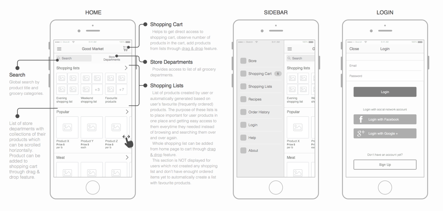
The UX Designer on the team provided me with the following wireframes.
Visual Design Research
Interface Inventory
I conducted an interface inventory from the provided wireframes to check for any inconsistencies, account for all components I would need to design to support the app’s functions and capabilities.
UI Patterns
After reviewing the wireframes, I categorized the screens I would need to design and researched UI patterns for machine-learning, search, food photo display, recipes, and making shopping lists to provide users with the best experience possible. From here, I identified the correct usage of the pattern so I could take the appropriate elements and use them towards my design solutions.
Assessment
After reviewing all the material and with the client’s goals in mind, gathering research on UI patterns, and researching current design trends in the machine-learning space, I went back to the wireframes to evaluate the designs. My notes are in the red below.
Visual Design
UI Kit
I started my process by finding a UI kit to serve as the basis for my designs to enable a more efficient design process. Using these as a rough base, I adjusted the elements to fit my client’s needs for a clean, minimalist, and fun interface that would appeal to their target audience.
Implementing the Brand
I implemented the brand with the original assets (logo, mood board, colors). During this design process, I felt that the original assets were not in line with the personas and voiced this to the client.
Client Feedback
The client agreed and came back with the following feedback:
The colors need to be changed. The new colors need to pop out more and be more engaging for our audience.
The UI needs to be more trendy. Can you take a look at the top trending apps for grocery delivery or delivery services in the App Store or Play Store and see what you can remix?
We want to highlight the UI for the machine-learning feature of the app. Can you design a layout for Past Orders on the home screen?
Implementing Client Feedback
I updated the style tile and mood board with what I believed would more successfully appeal to My Daily Nosh's audience.
Updated Comparative Research
I added two new companies to the comparative research list.
Thrive Market is an e-commerce membership-based retailer offering natural and organic food products. Users can filter their search results by more than 70 different diets and lifestyle choices. It also uses machine-learning technology to learn people’s preferences, has a blog component featuring articles that align with its customer base’s values, and has an extremely well-designed user interface. The downside is that it doesn’t automatically price match, causing some distrust and frustration for the user who often feels like they need to compare the same product offered on different platforms.
Whole Foods offers high-quality, fresh groceries via Amazon’s powerful platform. It uses machine-learning technology to learn users’ shopping habits and preferences to provide a personalized experience. You can pick backup substitutions, which are suggested by the app, in the case that your item is not carried at a specific location. Delivery to your doorstep is extremely fast and easy. However, the app is not particularly beautiful, and it doesn’t have a social aspect to it.
Design
Lean Usability Testing
Test 1: Click Test
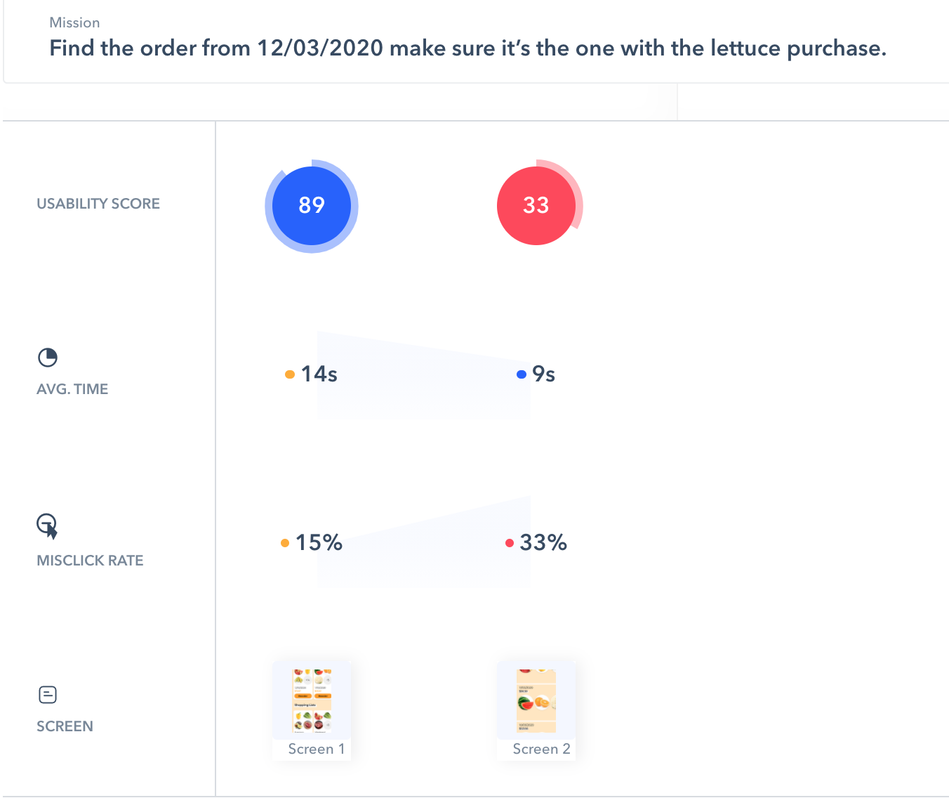
I conducted a click test to test the Past Orders flow with a prototype using Maze to capture user clicks via heatmaps and click success rates.
Number of Participants: 26
Tasks tested:
Find the order from 12/03/2020 make sure it’s the one with the lettuce purchase.
Replace the apples with grapefruit.
Remove Romaine Lettuce from the list.
Change the quantity of the grapefruit from 2 to 1.
Qualitative questions:
On a scale from 1-5 (1=low, 5 = high), how would you rate the visual aesthetics?
On a scale from 1-5 (1=low, 5 = high), how intuitive was it to complete the tasks?
What key words or feelings do you think of when using this app?
Was there anything frustrating about it?
Anything you particularly liked?
Anything you wish you could have or see?
Summary of Results
Overall Usability Score: 85%
Most problematic screen with most misclicks: List view of Past Orders
Most successful task: Changing the quantity of an item
Visual aesthetics rating: 3.6 (out of 5)
Intuitiveness rating: 4.3 (out of 5)
Likes: color scheme, item substitution feature, photo quality, felt intuitive
Dislikes: Some of testers felt that the design was busy and slightly overwhelming
Task 1: shows an overall very successful completion rate.
Task 1: The significant increase in misclicks when users take the secondary path to complete this tasks indicates that the second screen (List of Past Orders) be improved in its design.
Task 1 (deeper analysis): Once a user landed on this page, 50% continued on the path, and 50% went back home. This indicates that I can adjust the design on this page to help users get to their end destination in a more clear manner.
Task 2: Users were highly successful in completing this task. Qualitative data shows that they especially enjoyed the substitution feature as well.

Task 3: Remove Lettuce from the list Results show that users want to be able to remove an item by reducing its quantity to 0. I will suggest this as a feature to the developers.
Conclusion
Final Design
After analyzing the data, I focused on simplifying some of the design and updating the CTAs to be clearer. Specifically, I:
Removed photos from the Past Order tiles on the home screen, increased the date’s type size
Bolded the headers on Past Order screens
Removed white circles behind the arrows to reduce the number of overall shapes
Changed the orange button to say “Review Order” from “Reorder”
Learnings
Design + Photography
For an app about food, beautiful and clear photos are crucial. This was a consistent piece of positive user feedback. However, this means that the rest of the app can start to feel busy since food photography introduces a variety of colors, shapes, and sizes. To address this challenge, I focused on simplifying the design elements and removing the photos from the Past Orders section.
On Qualitative Data Collection
Don’t ask for qualitative data unless it is possible to design a more robust questionnaire. I was limited by Maze’s 10 questions and used half on click tests and the other half on qualitative questions. However, I realized that only being able to ask 5 questions resulted in insufficient data to understand a user’s reasoning.
My Recommended Next Steps
For the next design iteration, I recommend:
Designing out the My Recipes flow as testers pointed it out and seemed particularly interested
Run a more in-depth qualitative test to understand preferences


