Evergreen
Evergreen is a mobile app and digital platform for preserving your family story. Whether this includes stories about how a couple met, collections of childhood memories, or grand lifetime experiences, family members can preserve and produce an evergreen tapestry of stories that can be accurately recounted and shared with future generations—from their own mouths.
My Role: UX Research | UX Design | UI Design
Links to Interactive Prototype: Onboarding | Create a Story | Find a Story
Overview
The Challenge
The client came to me with an idea that he had to enter a business venture competition. Currently, there are no platforms in the market that provide an intuitive, safe, and secure space for families to remember, digitally record, write, and share their family-specific stories. Existing platforms and apps are not made specifically for families; therefore, such user groups do not have a viable alternative to use and have large unmet needs. As such, many families lose their unique stories to time, physical distance as members move away, and most, unfortunately, death.
The Solution
The Evergreen app allows people to create and upload family-centric content in a private space and also allows them to connect with each other. Evergreen makes it easy to remember your most cherished people and share their lives with other loved ones.
To start designing this app, I defined the MVP around the following flows: Onboarding, Create a Story, and Find a Story.
The Target Audience
Age: 15-60
Annual Income: 0-200k
Location: Large Urban Areas, Suburban Areas, Worldwide
Interests: Social Media, Photography, Reading, Cooking, Arts & Crafts
Attitudes: Curious, Caring, Seeks Connection, Seeks Understanding, Social, Responsible
Challenges: Physical separation due to living in different areas, Unnatural behavior in connecting with family, Might feel like too much effort to create a story
Process
Research
Strategy
Information Architecture
Low Fidelity Wireframes
Branding & Identity
Visual Design
User Testing
Conclusion
Research
Client Goals & Desired Outcomes
The client wanted to create an app that allows people to create and upload family-centric content in a private space that allows them to connect with each other.
Specifically, I was tasked with designing:
Onboarding flow: Design an engaging onboarding experience that convinces the user to sign up and make an account
Create a Story flow: Design an in-app content capturing and creation experience that doesn’t rely on a tutorial to show the user how it works
Find a Story flow: Design an intuitive way to find a story through several paths, depending on that user’s specific goal at the time
User Research
I used quantitative & qualitative research methods to set the foundations for my design. I asked my personal network and a variety of message boards to source participants.
Quantitative Research
68 participants
Online Survey
Multiple platforms, forums, personal network
Qualitative Research:
17 participants
Follow Up, In-Depth Survey
Pooled from the first survey
Key Takeaways From User Research
Quantitative Research Results
95%
Wish they knew more about their parents’ or grandparents’ lives
89%
Enjoy looking at photos and videos of family members when they were younger
95%
Would want their children or future children to be able to pass on stories about their parents and grandparents
84%
Stay connected with their family via phone calls
77%
Stay connected via group messaging apps
66%
Stay connected via video chatting
How confident are you about relaying your family stories and memories to your children/future children or to other relatives, on a scale of 1-5?
How important is it to you that the future generations know about family traditions and stories about yourself, your parents, and your grandparents, on a scale of 1-5?
To share photos, videos, or messages, participants used devices in the following order:
Mobile most often
Laptop or Desktop sometimes
Tablet or iPad least often
Participants ranked topics of interest in the following order:
Stories of Childhood
Stories of How They Met
Stories of Hardship or Success
Life Advice
Family Recipes
Qualitative Research Results
When asked, “What apps or platforms do you use to capture, record, or store family-related content like pictures, videos, written memories,” people said:
“Too much other content makes [other apps] distracting.”
— Participant 3
“[I feel like] a dedicated section to share family stories or a prompt to do so [is missing from other apps].”
— Participant 7
“[I dislike] when it is difficult to upload photos, share, and/or look back at all memories in an organized way.”
— Participant 4
Competitive Analysis
I researched four competitors, three of which were the top mentioned apps from my user surveys. One is a product similar to Evergreen.
Instagram and Facebook are the most ubiquitous social media platforms in the world right now. With over 1 billion users, many have family members on the platforms as well, allowing them to stay connected and updated. However, most people follow hundreds of other users, making the content they see a disorganized mix.
Group Messaging Apps allow family members located across the world to create group chats and stay connected with each other. However, the primary usage is for communication. When any media or content is shared, it quickly gets buried in following messages, and there is no organization beyond upload date in the file storage system.
Cloud Storage is great for uploading and sharing a large number of files. The biggest ones such as Dropbox, Google Drive, and iCloud are intuitive and easy to use. However, they quickly accumulate too much data, and shared folders are rarely revisited. There also is not much social interactivity beyond sharing the album with others.
StoryCatcher allows people to easily create and share video stories from different remote locations. It’s simple to use and also comes with interviewer prompts and tips. Its weakness is that it costs $4.99 upfront to use it without allowing the user to explore and fall in love with it. Its user interface design is also outdated.
Based on my research, I decided to design an experience that would leverage existing user behavior around social media apps and provide people a place to create, upload, and share family-specific content in a safe space.
Strategy
Personas
Demographics
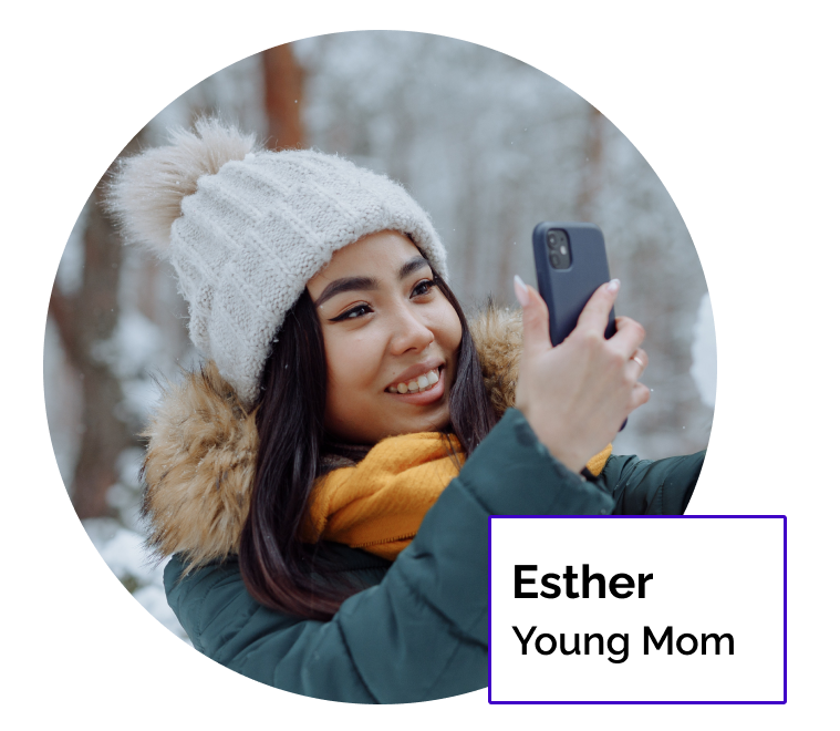
29 years old, Digital Marketing Analyst
Married, new mom
Went out of state for college; worked and lived a few years in a new state, but returned to her hometown afterward
Eldest of three children in her family
Behaviors & Beliefs
Regularly uses Instagram
Close with her family and considers her siblings her best friends
Is in a large extended family chat where family announcements, shoutouts, and photos are shared
Has thousands of photos and videos on her phone
Goals & Needs
Wants a way to capture and preserve stories that come up during family gatherings, especially from her grandparents
Needs a clear organizational system for uploaded content
Doesn’t want content clutter from others
Needs an easy search function
Demographics
32 years old, Cloud Engineer, non-profit Founder
Single
Went to state college; found a job in his hometown
Has one older sister, adores his nephews
Behaviors & Beliefs
Uses Instagram to stay updated on friends and family; posts occasionally
Regularly calls or video chats with family members through messaging apps
Extremely busy in his life stage, but does want to meet someone soon and start a family
Scrolls through Facebook when he has idle time
Goals & Needs
Wants his future children to know stories about his parents and grandparents, but not that confident that he’ll be able to relay stories accurately
Wants to keep his family and friends separate on social media, but wants the ability to share the same content to both circles if he chooses
Needs easy in-app photo and video capturing
Demographics
53 years old, Merchandise Coordinator
Remarried
Went to a state college; lives in close proximity with her family
Most of her kids live in town, but some currently work out of state
Behaviors & Beliefs
Joined Instagram to stay updated on her kids’ lives and follows a small circle of friends
Posts photos regularly without spending too much time editing photos
Has large family gatherings and loves having everyone together for holidays
Doesn’t like when Facebook gets too negative, political, or opinionated
Talks to her parents on the phone frequently
Goals & Needs
Wants to keep her family content private
Needs a clutter-free experience
Wants to feel connected to her family across the US
Enjoys iPhone’s automatic memory look backs
Wants to download pictures that she likes
Information Architecture
User Stories
I created user stories based on my research insights. I prioritized them by their inclusion in the three MVP flows (onboarding, create a story, find a story) and by their desirability according to user research.
As a new user, I want to explore the app, so I know if it’s worth signing up or not
As a new user, I want to create a story, so I can know if it’s easy and fun to use
As a user, I want to find a story, because I want to learn about my family members
As a user, I want to capture stories directly in the app, to minimize the number of steps involved in uploading the story
As a user, I want my children/grandchildren to know about my parents/grandparents, so they know where they come from
As a user, I want to invite other family members onto the app or platform, so they can start contributing
I decided not to create user flows for Medium and Low priority stories since they’re not part of the MVP.
User Flows
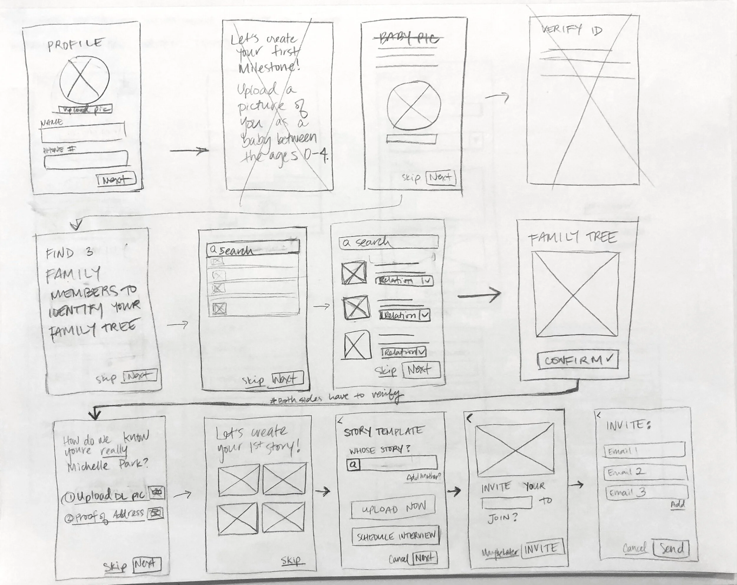
I created user flows to visualize the path a user would take through my interface to complete the high-priority tasks identified in my user stories. This helped me understand the kind of visual hierarchy I would need to design and how all the elements would relate together.
Site Map
Version 2
My biggest main changes were eliminating “Schedule” as a primary page and replacing it with “Activity.”
According to my usability testing, having to schedule something with family felt very inorganic. Based on that feedback, I decided to keep the functionality but deprioritized it on the tab bar. Instead, I added a button to increase the app’s social aspect by allowing a user to see activity by other family members.
Low Fidelity Wireframes
I began by creating lo-fi wireframes sketches of my screens for the three flows.
Digital Wireframes
Onboarding Version 1
Create a Story Version 1, Library (Home) Version 1
I realized the way I had set up my flows was confusing because I had combined the Onboarding flow and Create a Story flow as one. In the second version, I separated these out as distinct flows. I shortened Onboarding, fleshed out the Find a Story flow, and designed more screens for the Create a Story flow.
Digital Wireframes Version 2
Brand & Identity
With my user research, personas, and information architecture in mind, I designed a logo, selected typography, selected brand colors, and created a mood board.
My designs express ideas about connection, warmth, instilling confidence, passing stories on, being contemporary, and beauty.
Visual Design
Version 2
A challenge was keeping in mind that this app will host a large variety of content, and, thus, must remain neutral in most of its design. Additionally, it will need to appeal to an extremely wide range of users.
After struggling, I found a solution by:
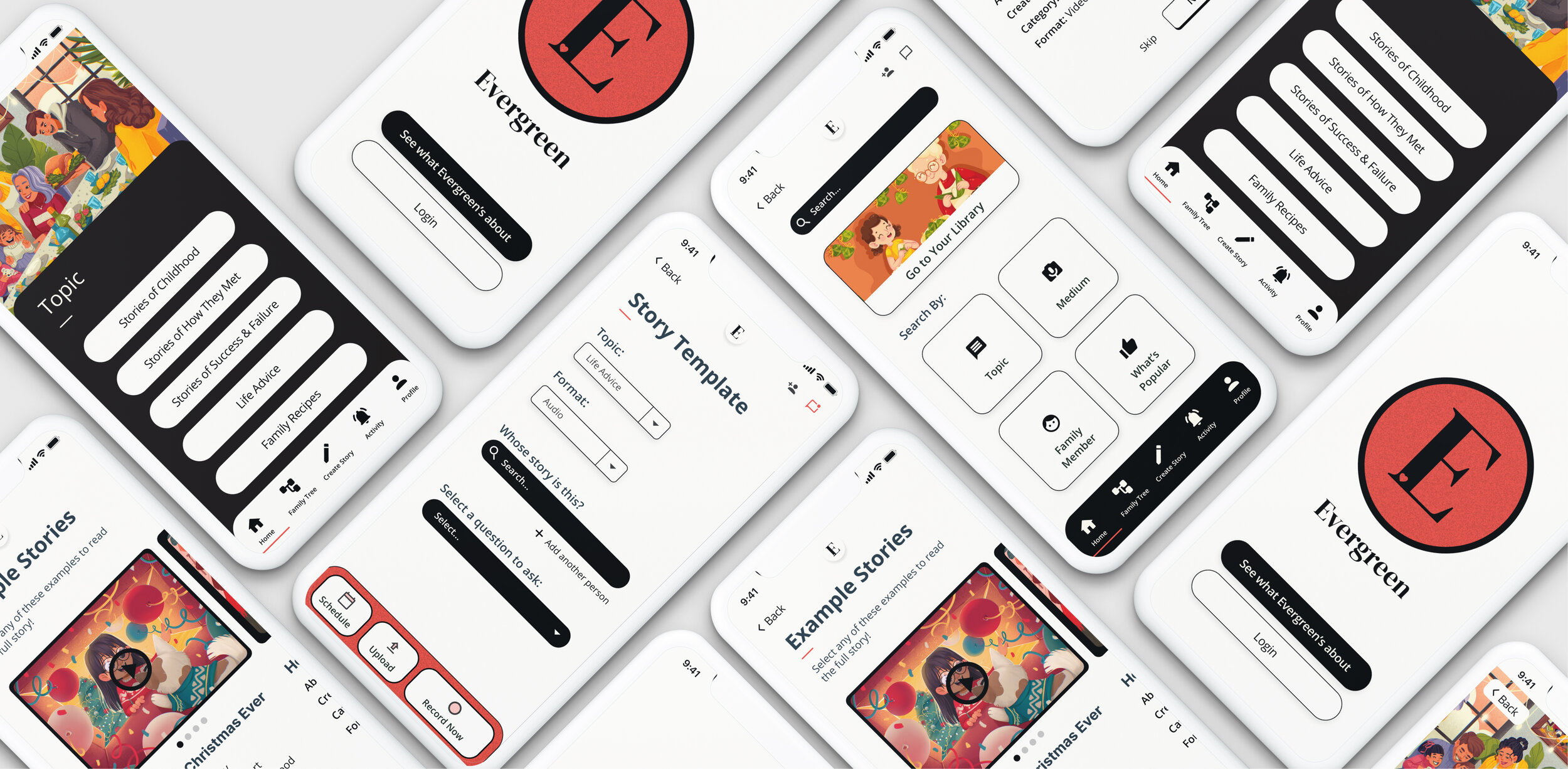
Introducing warm illustrations in the onboarding
Keeping the colors very simple and minimal to allow the content to shine
This clean design with splashes of the serif font and imbued with creative, fun, and warm illustrations strikes a successful balance in appealing to the mobile-savvy adult user while conveying an emotional message.
User Testing
I tested three participants on the three flows. Each user was given a set of three scenarios with 1-2 tasks within each.
Flow: Onboarding
Question 1: Is the “tailored experience” actually valuable, and does it help create a more delightful experience?
Conclusion: Testers didn’t feel that the tailored experience added anything. Testers had some confusion around what they could and couldn’t do with Evergreen. The messaging in onboarding needed to more clearly define what the app is, and what it is not.
Design Changes: I removed the tailored experience and added two new screens to very clearly define what a user can expect from Evergreen.
Question 2:
Do the example stories give enough of an idea to compel a user to sign up?
Conclusion: Seeing the family tree was unremarkable, and even confusing; the tailored experience was not that valuable. More people wanted to be able to explore the example stories but were disappointed that they couldn’t.
Design Changes: I removed the family tree and made the example stories interactive, so users could explore the posts. I designed new screens for the example posts.
Question 3: Are there too many steps? Does it feel too long?
Onboarding Flow Version 1
Onboarding Flow Version 2
Conclusion: Testers felt that the onboarding flow was slightly long with many steps involved.
Design Changes: I reduced the number of total steps by removing complicated verification requirements and the family tree for the MVP.
“I would be interested in Evergreen because I don’t know anything about my family story.”
— Participant 2
Flow: Create a Story
Question 1: Is the categorization of topics clear on the selection screen?
Conclusion: Yes, testers intuitively knew how to pick topics and questions. However, they asked about the ability to record right away within the app. This indicated that the copy (“Start”) was not clear. All testers also asked if they’d be able to upload later.
Design Changes: I designed a new Tab Bar specifically for the story template and distinct from the main navigation tab bar. I clarified the calls to action buttons with new copy and by adding icons.
Question 2: Is scheduling intuitive?
Conclusion: Scheduling is intuitive; however, all testers said it felt inorganic to schedule such a conversation with their family member. Everyone asked if they could record in-app.
Design Changes: I deprioritized the Schedule button from the main Tab Bar, designed new recording screens, and added a save drafts feature.
“I think this app would push me to film my parents. I like that it would help me explore things that I wouldn’t be initially interested in, even though this wouldn’t be the initial reason for downloading the app.”
— Participant 3
Flow: Find a Story
Question 1: Is it intuitive to search by a topic?
Conclusion: Some testers didn’t know where to go at first. It wasn’t immediately clear that the squares were buttons.
Design Changes: I added a header to clarify the “Search By” button functionality, redesigned the Tab Bar by removing “Schedule,” added “Activity” to highlight the app’s social component, and designed an in-app messaging capability.
Question 2: Do users enjoy the commenting features and the social component of the app?
Conclusion: People loved the social aspect. A few commented that it looked like Youtube
Design Changes: I introduced a tertiary color and adjusted the button designs to differentiate it from Youtube. To add more social features to the app, I designed in-app messaging abilities and added the “Activity” tab to the Tab Bar on the Home screen.
“I really like the social aspect of this app.”
— Participant 1

Conclusion
My Recommended Next Steps
In order to keep improving on the UX of this app, I recommend taking the following steps:
Deploy a large scale survey to a representative mix of the U.S. population to gather more accurate user data on their needs, pain points, and desires relating to a family-centric app
Conduct a preference test to validate that the name and visual design appeal to the user base
Loop in developers to provide insight on what is technically feasible
Final Thoughts
I especially enjoyed the evolvement and iteration of this project whenever I received user feedback. At the end,
I accomplished a design that is clean and mature, yet warm and inviting
I developed an MVP that allows users to understand the value of the app immediately
I learned the importance of having a full understanding of technically feasible features before starting the design process


